UX Research
A Diary Study to Improve Home Health Assessments
Summary
Designing solutions for people where they are.
Tools that are difficult to use make challenges in our environment even worse. That’s why it’s so important to understand the details in the real world where the tools we design are being used. We need tools that work for us rather than forcing us to work harder to use them.
This project morphed from basic prototype usability testing to an in-depth diary study because we saw early on that the user interface was only part of the problem. We needed to get into the details of how the tool was being used, which is challenging in a healthcare environment where privacy is at a premium.

7
Months
8
User Interviews
20+
Prototype Usability Tests
110
In-Home Visits Tracked
The Problem
Balancing efficiency with quality.
The client - a leading national provider of in-home and mobile health solutions - was struggling to get their in-home visit times down. They knew the app that their medical professionals used to log information from patients was clunky and inefficient, so they asked our team to help them optimize the app and find ways to make visits more efficient.
They faced challenges of competitive daily margins, clinician fatigue, and intense medical charting requirements. The app was initially a marvel of resourcefulness but it heavily relied on pre-made components and frameworks. The resulting product experience was merely functional and forced a huge amount of cognitive load onto providers and patients.
The difficulties with the app were contributing to an already challenging environment. Medical providers were asked to do these visits more efficiently while asking a slew of medical questions, and conducting physical exams and diagnostic tests. Providers needed to balance efficiency with accuracy because errors in the data could lead to HIPAA violations and hours of extra work each day fixing mistakes.
“My goal is to keep them (patients) happy, healthy, living in the home, and out of the hospital.”

We started with a kickoff workshop to determine success criteria and a design and research plan moving forward.
The Solution
Designing a system that works for users.
I was the sole researcher on our consulting team that consisted of a project manager, front-end UX designer, and back-end engineer. We started with a kickoff workshop to help the clients’ business groups align on shared goals and success metrics, user personas, and a timeline of the next steps.
We crafted a plan that paired design and research together to validate decisions as they were made and reduce the investment risk on the client’s part.
“I don’t dread using this application. I just think it is a bit more labor-intensive than it could be if it were more intuitive.”
The Process
User Interviews
To get an initial overview of health professional's experience with the existing app, I conducted a quick round of eight user interviews to help us start to determine which improvements might deliver the highest impact.
I found that app components were hindering usability at the most fundamental level. My component-level recommendations were passed along to the design team for immediate improvements.
Prototype Usability Testing
As the design and development teams rolled out improvements, I worked in two-week sprints alongside them to test the newest designs with 4-6 new healthcare providers each sprint.
I specifically designed these remote usability testing sessions to gather feedback on new screens, features, and elements while at the same time gathering cumulative insights into the overall app and prototype experience. In all, we tested and improved more than 30 new screens.

Diary Study
After several months of testing and implementing new designs for the app, we were so far ahead of the development team that we needed to decide how best to use our resources going forward.
I felt we still needed more understanding of the environment in which the app was being used because our prototype testing sessions suggested that many of the biggest pain points were coming from outside the app itself.
HIPAA privacy laws prevented me from doing field research and shadowing healthcare providers during in-home visits, so I designed and pitched to the client an in-depth diary study in which providers would log their daily activities to give us contextual insights into their needs and how they managed a full day of visits.
After a week of daily entries from about a dozen healthcare providers, I produced a comprehensive report that mapped out how to continue designing a holistic experience and system suited for humans rather than machines.


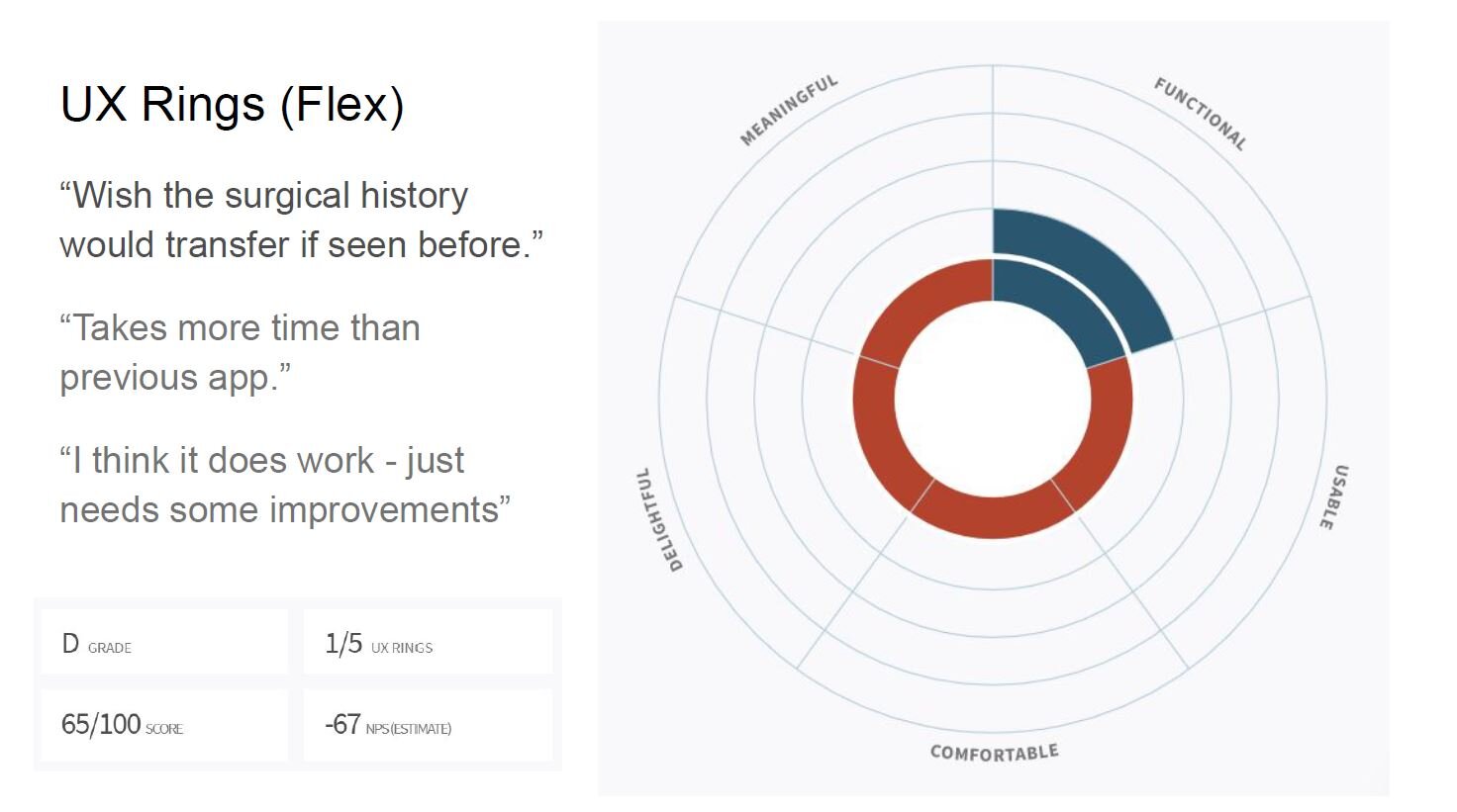
“I wanted to share my delight and appreciation for the robustness of this (Diary Study) document. Excellent work. Thank you.”
The Results
On track for improved in-home visits.
The COVID-19 pandemic completely changed the company's model for conducting health assessments and forced them to transition rapidly to e-health visits. By the end of this project, we had significantly improved the app through our new designs which led to improvements in the time it took to complete an in-home visit and the accuracy of the information captured during those visits.
User feedback from healthcare providers was overwhelmingly positive as we addressed one-by-one each of their major pain points and made them feel they could complete their tasks and do their jobs easier. We were well on our way to our ultimate goal of continuing to design a holistic experience and system suited for humans, rather than machines, that rose to the high bar of a Delightful user experience.
